

The Anita Space services page features watercolour and lipstick techniques for permanent lip makeup. When looking for examples, you may also come across the word “nude”. These names can help you find your bearings, but they do not replace a conversation about a specific look. To make an informed choice, discuss the colour, intensity and how noticeable you want the emphasis on your lips to be as separate points.
Watercolour and nude describe different things
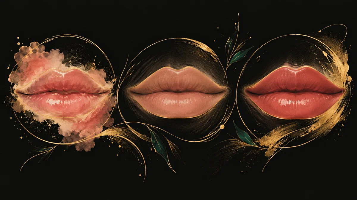
A watercolour look is usually associated with lighter-looking coverage and a softer impression of colour. “Nude” is more a description of a subtle shade close to a natural palette. So saying “I want nude lips” does not yet explain whether you want the most delicate definition possible or a more noticeable finish in a muted colour.
It helps to explain exactly what appeals to you in an example: translucency, a pink or warmer shade, the absence of a visually sharp edge, or an overall impression of understated makeup. Two photos labelled “watercolour lips” can differ more than their name suggests. Discussing specific features is more precise than relying on the caption alone.
What a lipstick effect means
A lipstick look creates a more defined impression of made-up lips. It may appeal to someone who is used to wearing lipstick and enjoys a noticeable colour accent. However, a lipstick effect does not necessarily mean bright red. A muted palette and visual density are separate qualities that should be agreed on independently.
If you only wear lipstick in the evening, consider whether you want a similar level of definition in your everyday look. Try describing the appearance you want without mascara, foundation or blush. This helps you understand whether a lasting accent will feel comfortable with your style, rather than choosing solely to suit special-occasion makeup.
Discuss the shade in relation to your own lips
The colour in a photograph of another person or on cosmetic packaging should not be treated as an exact prediction. The starting appearance of your lips, lighting and overall harmony with your face matter. Show your favourite lipstick as a reference for your taste, but ask the artist to explain how they see that colour direction working for you.
You can bring two examples: an everyday shade you feel comfortable with and a colour that seems too intense. This makes it easier to establish your boundaries. If you dislike cool pink, brown or orange tones, say so directly. “Anything natural” leaves too much room for different interpretations of the result.
Agree on the outline and colour separately
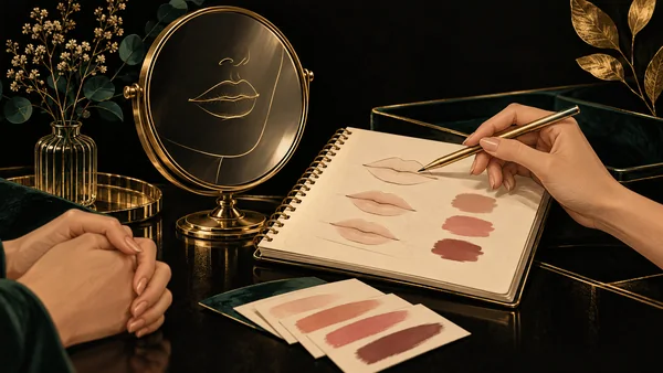
Sometimes you may like the shade in a photograph but not the shape or the character of the edge. Separate these questions: which colour feels right, how defined you want the coverage to be and how you want the outline to look. At the design stage, ask what the drawing represents and how it relates to the agreed effect.
Neither approach is automatically better or more natural for everyone. A subtle watercolour look and a more defined lipstick effect can suit different preferences. Explore Anita Space's services, choose clear examples and leave the final decision for a detailed discussion. The most valuable outcome of a consultation is being able to explain, in your own words, the intensity, palette and overall impression you have chosen, rather than simply naming a technique.